UI Guide
AdbAutoPlayer features a highly customizable and intuitive interface. This guide explains the various components and how to personalize your experience.
Main Components
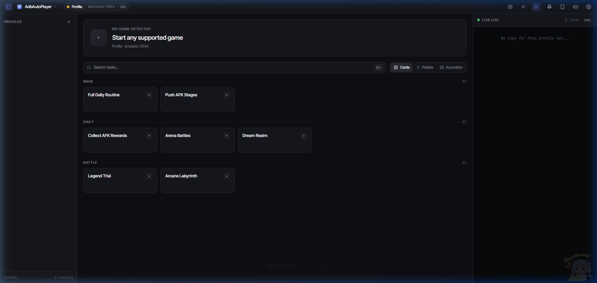
1. Sidebar Navigation
The sidebar allows you to manage multiple profiles. Each profile can have its own settings and active game.
- Toggle Sidebar: Click the menu icon in the top left to expand or collapse the sidebar.
- Add Profile: Use the “+” button at the bottom of the sidebar to create a new profile.
2. Status Bar
Located at the top, the status bar provides quick access to global actions:
- Theme Customizer: Adjust colors and switch between Light/Dark modes.
- App Settings: Configure global application preferences.
- ADB Settings: Quick access to ADB configuration for the active profile.
- Game Settings: Manage settings specific to the currently detected game.
- Docs: Open this wiki!
- Debug: Run debug tasks to troubleshoot detection issues.
Settings Overlays
Clicking any settings button opens an overlay where you can modify configurations.
- ADB Settings: Configure your device connection.
- App Settings: General program settings like theme and language.
- Game Settings: Settings specific to the currently selected game.
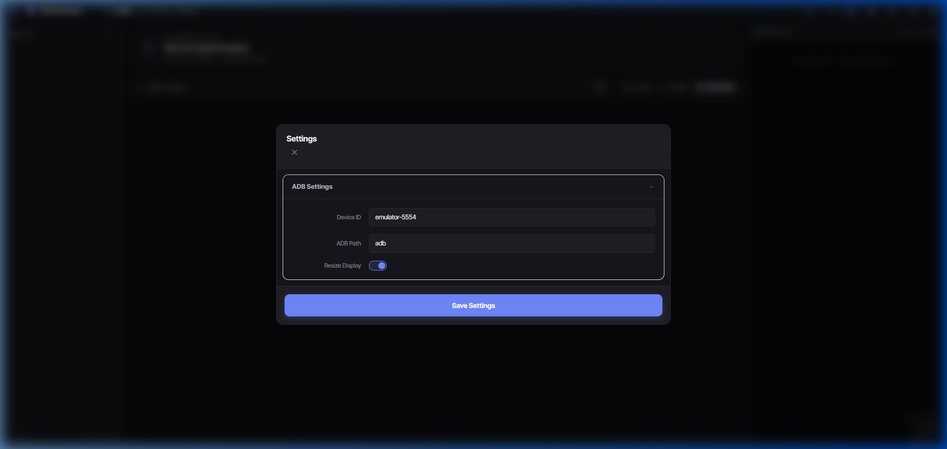 ADB Settings
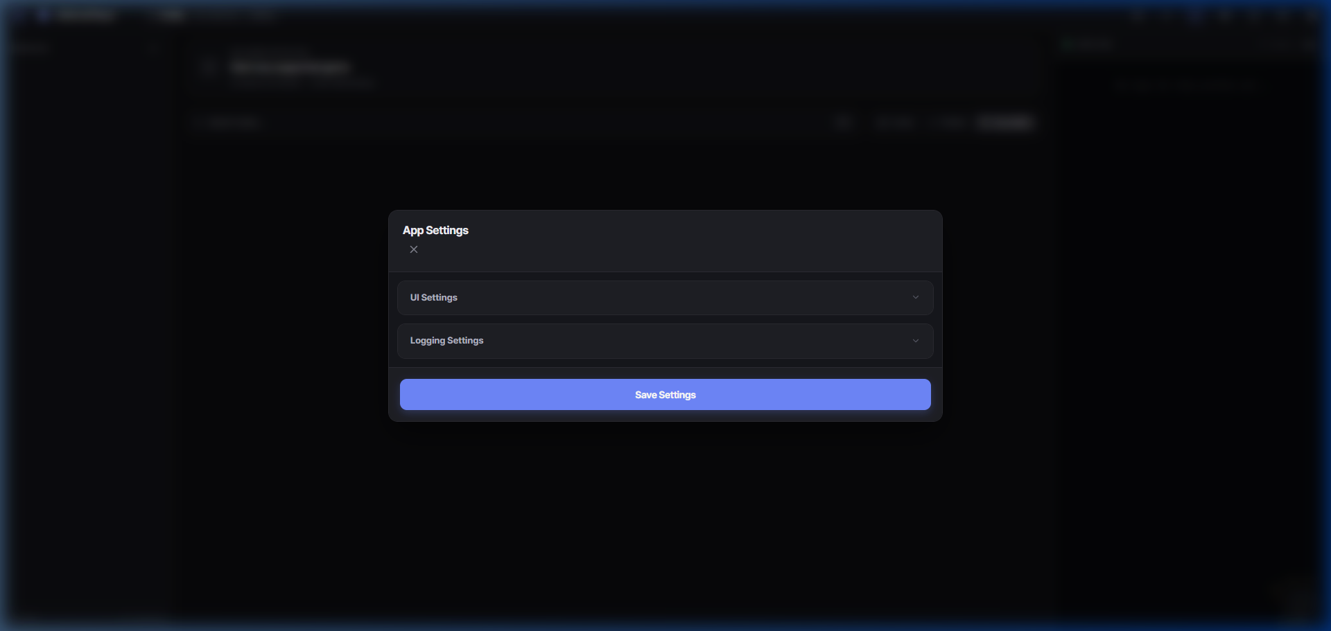 App Settings
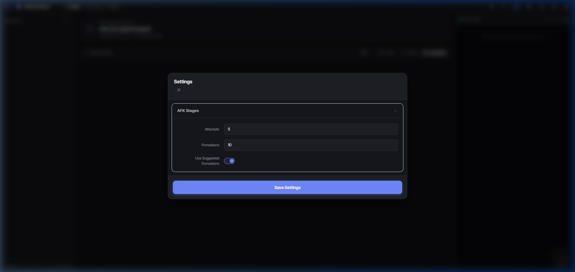 Game Settings
3. Log Panel
Monitor the bot’s activity in real-time.
- Toggle Log: Click the terminal icon in the status bar to show or hide the log panel.
- Log Level: Choose how much information you want to see (Info, Debug, Error).
Customizing the Look
Theme Customizer
Click the palette icon in the status bar to open the Theme Customizer.
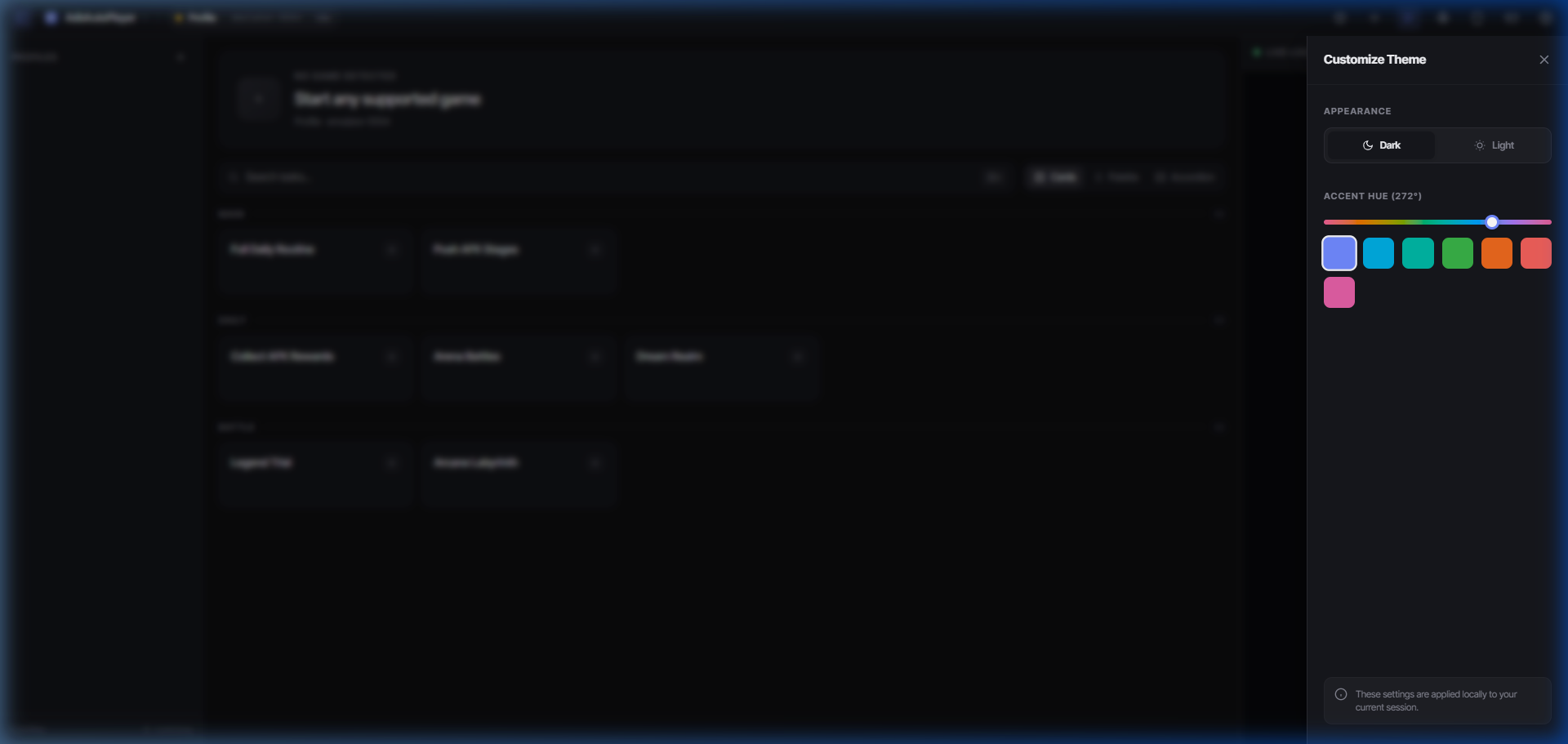
- Mode: Switch between Light and Dark themes.
- Accent Color: Use the slider to pick your favorite accent color for the UI.
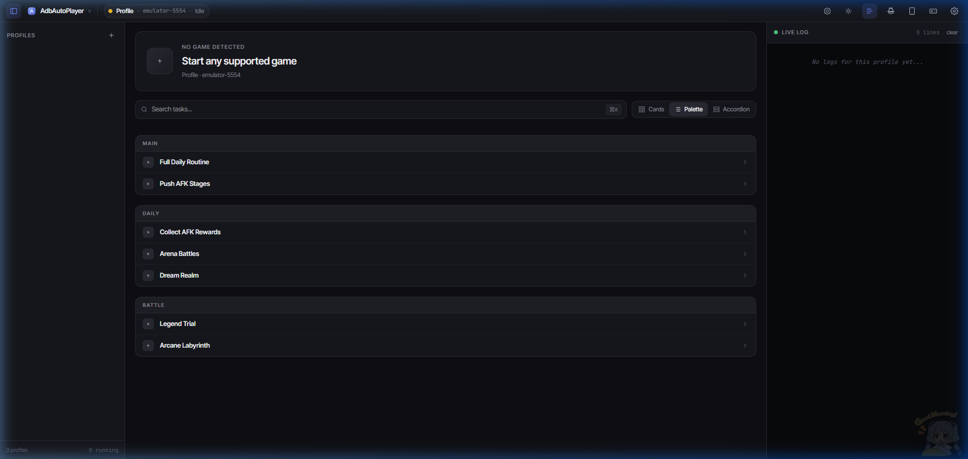
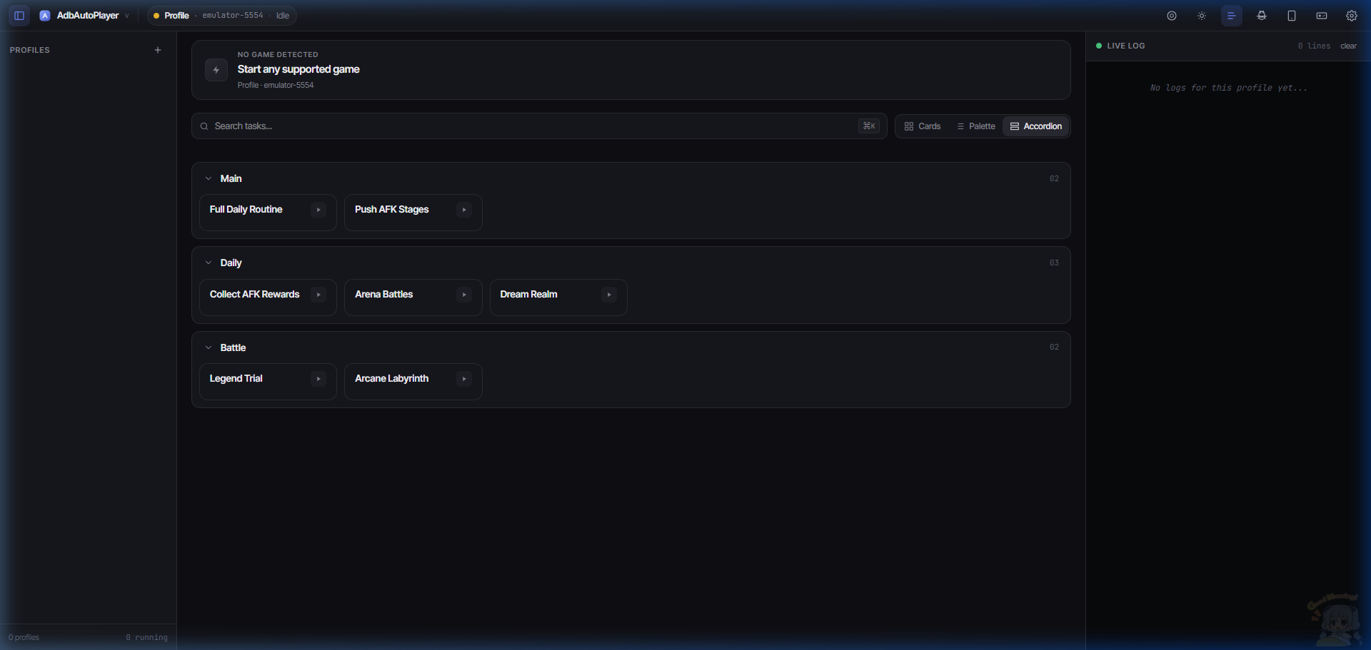
View Modes
You can change how tasks are displayed in the dashboard by selecting a different view mode in the Theme Customizer:
- Cards View: (Default) Large, easy-to-tap cards for each task.
- Palette View: A more compact grid view.
- Accordion View: Group tasks by category in collapsible sections.
 Palette View
 Accordion View